


AVIVA

Aviva - Health Insurance View and Update Claims
Overview
Aviva is one of the UK's largest general insurers and a leading life and pensions provider. Aviva's main activities are the provision of general and life insurance, long term savings products and fund management services. From car insurance to critical illness cover - Aviva offers a large amount of different insurance and savings products.
MyAviva provides customers with a simple way to view and manage their insurance, savings and investment policies all in one place. Specifically for this project I worked on a health insurance product, and the journey customers had with this product within MyAviva.


Artifact:
User Research, Competitor Analysis, User complaints, Wireframes, Mockups, Prototype
My role:
UX Designer, UI Designer
Objective
The objective was to redesign the current journey for customers who wish to view and update their health insurance claims in order to simplify the process and reduce confusion.
-
How can we make it clearer to customers using the App where they need to go to view and update existing claims?
-
For those customers who visit the main claims page on web, how do we make the “your claims” section more prominent?
Updating existing claims should be easy – however, it was believed that the current user journey was not consistent and somewhat confusing resulting in customers not specifically knowing where they would need to go to, to see and update their existing claims on both App and web, resulting in customers contacting customer service to inform Aviva about updates to their existing claims. This would potentially at times also lead to duplication, and result in customers creating duplicate new claims.
App to Mobile Web


Web and App view of the previous make a claim page design
Business Goals
-
We need to create a simpler and clearer way for customers to view and update existing claims.
-
We will need to improve the description within the existing claims section, in an attempt to draw customers towards this option prior to them creating a new claim, in order to prevent customers from creating duplicate new claims in an effort to update us about existing claims.
-
We need to reduce the number of duplicate claims and provide a clearer user journey for customers in the event they wish to update their existing claims.
Process
Initially I engaged with our UX research team and data team to identify whether there were any previous research studies carried out in relation to health insurance claims and the existing health insurance journey.
Through discussions with the Health Digital Team, it was identified that there were the following pain points with the current journey to view and update existing health claims:
-
Users are unclear whether they need to create new claims to update their existing claims.
-
Users at times contacted customer service by phone to supply additional information for existing claims.
-
Users at times created duplicate claims to supply additional information regarding existing claims.
-
The “Your claims” hyperlink is at times missed by customers.
As well as learning about this health insurance product, I sought to learn more about the different types of health insurance products available at Aviva and also about health insurance claims, and the current user journey to make claims. I also looked at some of the claims journeys that other Aviva products had and also researched our competitors’ journeys.
Design
I explored different ways to present the journey and started by creating wireframes based upon the sketches of the potential designs, and then created a prototype of the revised design.
I then presented the initial designs to the team in a playback. The decision was made to amend existing copy to clarify this step for customers, whilst keeping the new design consistent with the current design.
After iterating and exploring some different approaches, I presented the following final designs to the team in a playback, and these designs were carried forward.


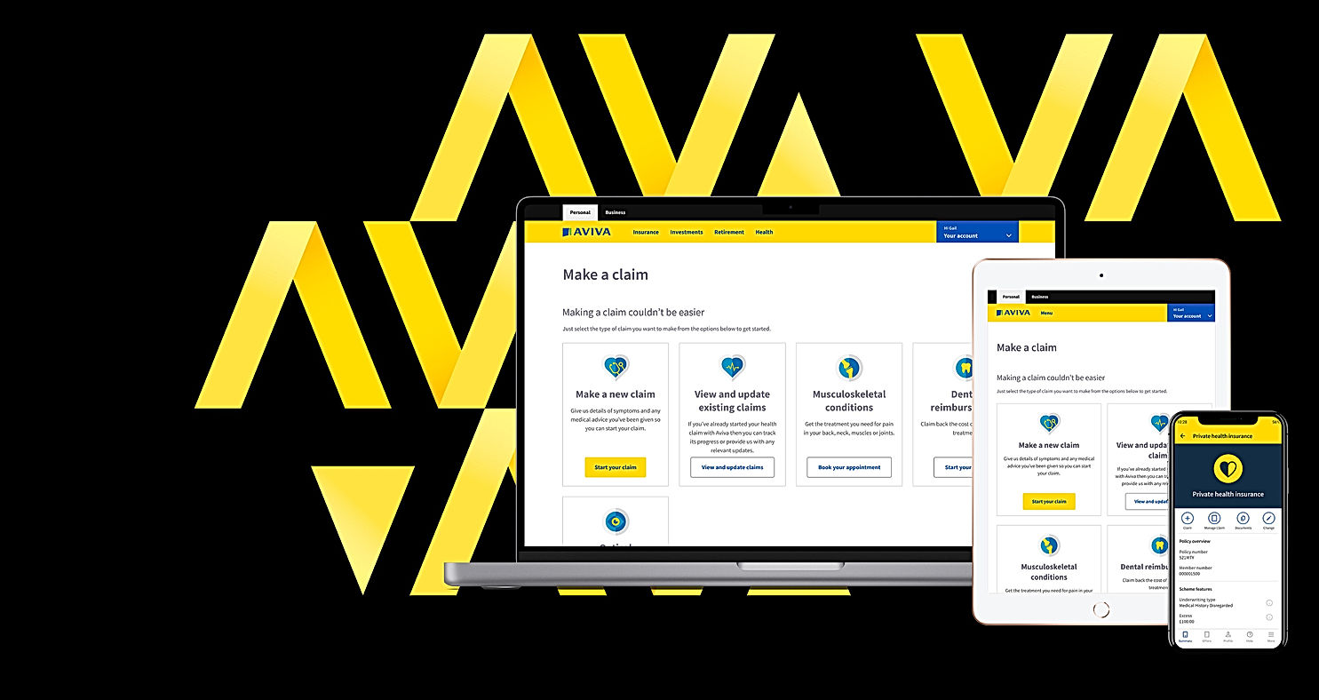
The new “claim” icon button on the App experience provides a clear and concise illustration of what would be achieved in the event a user selected this options. The new "manage claim" button also provides a differentiation between starting a claim and managing your existing claim. The “help” icon button was removed as it was found that the button was duplicated and could be easily accessed via the navigation bar. The new “View and update existing claims” card on the make a claim page emphasized to customers that there was a difference between starting a new claim and viewing or updating existing claims. The wording and layout of the make a claim page is also simplified and concise. This new design allows customers to view and update existing claims easily before moving on if they wish to do so.


Previous design:
New design:
Example of some of the changes made to the Private Health Insurance product page
Final Designs
Here are some views of the final designs for the new App journey:


These are some of the final designs for the new web journey:
.png)
.png)
.png)

Evaluation
The new App and web journey for viewing and updating health insurance claims was released in early 2023. While it's still quite early to determine the success of the amended journey, at present the experience has had a marked improvement in how users update existing health insurance claims.

